On the internet and in the streets, people are awash in blue.
It’s not quite turquoise or aquamarine. It’s deeper than robin’s egg and louder than cornflower. This blue brings to mind the Ionian Sea and the works of David Hockney as much as it does antifreeze and mint mouthwash.
“It’s this searing, kind of psychotic blue,” said Liana Satenstein, a fashion writer (and occasional contributor to The New York Times) who was an early proponent of the trend.
Somewhere between teal and cyan, its exact hue can be hard to define – which may account for the slippery way the fad is manifesting online where, according to Google metrics, searches for “aqua blue dress”, “aquamarine dresses” and “turquoise top” have all risen this year.
Despite Meryl Streep’s impassioned speech in 2006's The Devil Wears Prada (and brought to attention again with its sequel this year), “cerulean” remains a mostly esoteric term.
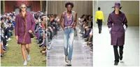
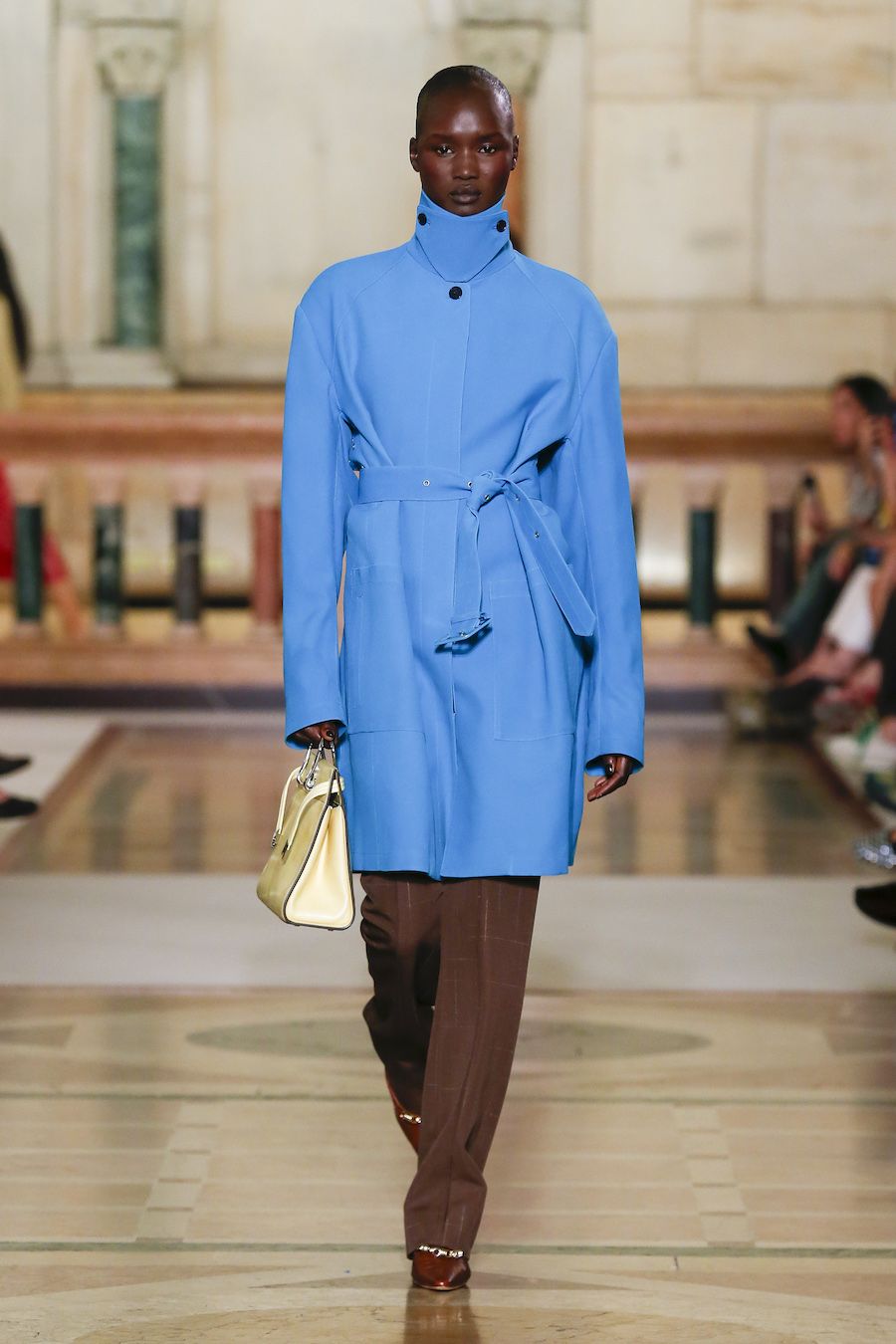
It cropped up on recent runways for Prada, Tory Burch, Dries Van Noten, Burberry and Celine, where the shade sometimes appeared alongside a spectrum of other blues.
This season’s collections by independent brands, such as Paloma Wool, are similarly swimming in it.
Read more: When fashion gets ugly? The luxury appeal of looking worn, torn and dirty
Colour trends can be dubious. Depending who you ask, it’s still the time of “a pop of red”.
Early this month, Business Of Fashion declared: “Lilac is beauty’s new nude.”
But as compared with recent trending colours, like burgundy and butter yellow – low-key shades ready to be absorbed into the palette of quiet luxury, the hues of the moment tend to be more saturated and cheerful.
The colour family “has repeatedly resurfaced during periods when fashion has embraced optimism, innovation and cultural change”, said Sara Maggioni, the head of womenswear at trend-forecasting firm WGSN.
In the 1960s, she added, “it echoed the optimistic palette of Space Age and mod fashion”.
Cleo Camp, the Los Angeles-based designer, was an early adopters of this latest shade.
In a collaboration with Satenstein last October, Camp released a special edition of her bestselling Cleo tee in a colour they called “splash”.
The women had been in need of a vacation when the colour came to them, Cleo recalled.
The 1990s-era ads for Sandals resorts, featuring crystal-clear beaches and swimming pools, had been one source of inspiration.
Also indelible was a blue silk Gucci shirt worn by Madonna to the MTV Video Music Awards in 1995, “the year Courtney Love threw a makeup compact at her”, Satenstein said.
The colour felt bold when the two looked around at the rest of the market, prompting questions like – would it pair well with the more muted tones many were gravitating toward?
“There were times when we thought, Is this crazy? Is this an insane colour to market?” Camp said.
But when she released the splash tops they sold out overnight, and a second and third batch of preorders sold out just a few days later.
For now, they have no plans to bring back the colourway, she added, but it remains her label’s most asked-about piece.
Other brands have since dipped their toes into the water. Kotn, the Canadian retailer, brought out two tank tops in “cerulean”, and Amsterdam brand Flore Flore rolled out “azur”.
Read more: Why jeans remain a fashion staple, even for those who hate wearing them
Last month, designer Emily Dawn Long put up on her website a boatneck sweater in a marine hue she called “Greece blue” in an interview (it goes by “aqua” on the site).
Like Camp and Satenstein, she too had been musing on the 1990s and early aughts.
In an homage to the Tracy Feith dress donned by Carrie Bradshaw in a 2001 episode of Sex And The City, the colour also appears in Dawn Long’s collection alongside a shocking red.
“That blue goes well with everything,” Dawn Long said.
“Red especially,” she added. “It feels very Superman.”
Maggioni said the colour has semantic range that pulls it from the past and into our moment.
“Cerulean succeeds because it holds multiple identities at once: It’s bold yet familiar, nostalgic yet contemporary, and bridges the natural world with increasingly immersive digital environments,” she said.
It’s a colour that reemerged in the 1990s, helping to shape the futuristic look of the new digital age – perhaps best embodied by the bulging, blue backside of the iMac G3.
Launched in 1998, the computer was the first of its kind, a symbol of the decade’s digital optimism.
Sure, it looks great in grainy photos of an old computer you may look at wistfully, but is it really wearable?
“People are nervous to try it, but when they do, it’s like, ‘Oh my God!’” Dawn Long said. “It makes their eyes pop. It makes their skin look good. It makes everyone tan.”
Satenstein, also known for hosting the live QVC-like video series Neverworns, often dons the colour when she is on camera.
“That euphoric sort of blue is a good contrast for anything,” she said.
Counterintuitively, she added, “It’s a neutral, in a way.” – ©2026 The New York Times Company
This article originally appeared in The New York Times.