


Looking for a way to create interiors that feel calm, timeless and beautifully layered?
Soft hues like powder pink, powder blue, pale yellow and soft grey are subtle yet powerful colours in a designer’s toolbox.
These colours bring just enough personality to a space without overwhelming it, striking that perfect balance between serenity and sophistication.
Whether you’re aiming for a modern retreat, a cosy bedroom or an airy living room, these gentle tones can transform an ordinary room into something polished and inviting.
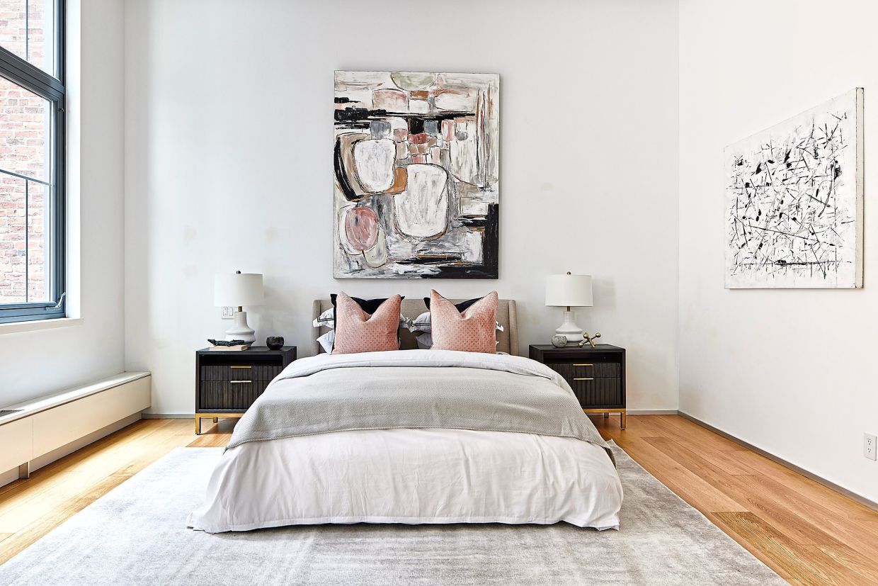
Do start with neutrals. Using soft hues as a "foundation” for a space such as for walls, flooring and larger furnishings helps to create an environment that is fresh, airy and bright.
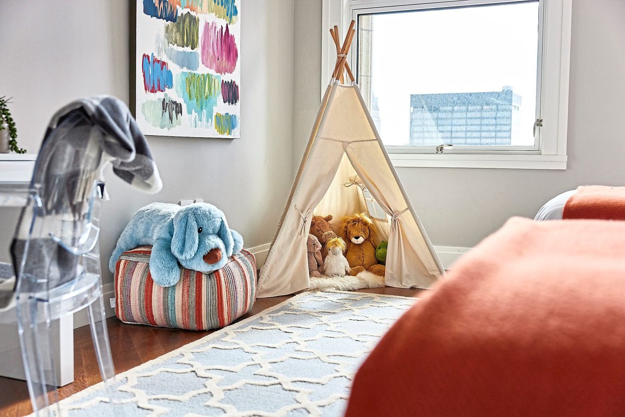
Do layer tonal shades. Mix powder pink with hot pint or pair powder blue with navy. These tonal layers add depth while staying harmonious.
Do pair soft hues with textured elements such as wood. Try pairing soft grey against warm wood or pale yellow with rattan.
Do use soft hues in areas where you want to create a sense of tranquility such as bedrooms and bathrooms.
Do mix soft hues with sharp contrast colours such as black, deep navy or charcoal to help "ground” a space.
Don't overdo it. Using too many soft hues can make a space feel washed out.
Don't forget lighting. Lighting can help highlight your colour palette.
Don't use more than three colours in a space. A good rule of thumb is to use no more than two to three soft hues in a space.
Don't skimp on quality. Choose high-quality fabrics, finishes and paint to help ensure a luxurious look.
Don't forget that soft hues can be "gender-neutral". Powder hues can be modern and universal. – Tribune News Service