
Swedish agency reimagines the design of Wikipedia


We all love Wikipedia, but for one design agency the website's typography was just begging for an update. 

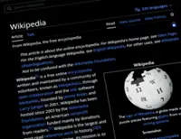
Swedish graphic design studio 1910 has reimagined the layout of the internet's most popular encyclopedia, simplifying its design while retaining the page's identity. The redesign involved stripping down a lot of what 1910 deemed to be 'distractions' from the actual text. 

The experimental project 'A Readable Wikipedia' resulted in the brand's art directors Jonas Salvador and Stellan Johansson increasing the size of Wikipedia's typography and centering content in the middle of the page. 

'A Readable Wikipedia' by 1910
'A Readable Wikipedia' on tablets

Images have been enlarged, there is more white space and the redesigned version of the site can be used on desktop, tablet and mobile technologies without the need for separate versions. 

"Wikipedia today is great in terms of content but not in terms of presentation," the duo wrote on the company's blog. "The text is too small, the lines are too long and the leading is too tight. 

"Pictures are tiny and the general layout includes a lot of visual noise that distracts you from the actual reading." 

The aim of the experiment was to demonstrate the importance of typography in website design. "This is the Wikipedia we ourselves would like to use," the pair explains. 

To find out more about the project, visit the agency's blog. — ©AFP/Relaxnews 2014 

Get 20% OFF The Star Digital Access

Monthly Plan

RM 13.90/month

RM 11.12/month

Billed as RM 11.12 for the 1st month, RM 13.90 thereafter.

Best Value

Annual Plan

RM 12.33/month

RM 9.87/month

Billed as RM 118.40 for the 1st year, RM 148 thereafter.

Follow us on our official WhatsApp channel for breaking news alerts and key updates!

Others Also Read