


With so much design focus on minimalism and neutral interiors dominated by taupe and black, bold colours remain a stable choice for those who prefer vibrancy in their environments.
While bright and bold colours work perfectly in fun spaces like children's bedrooms and playrooms, they can also work seamlessly in living spaces.
In general, go for bright and bold when faced with spaces that may not get much light or are overly dark, as these lively colours can serve as a welcomed energy boost.
When looking to incorporate bold, bright colours into your space, here are some do's and don'ts.
- Do use the colours you love in your space.
- Do consider citrus colours such as orange, lemon and lime as these colours tend to be vibrant, happy and bright.
- Do mix negative space into your room such as leaving trims, baseboards and some wall areas white. The negative space will help make your colour pop.
- Do consider using your vibrant colour as an accent wall or highlight.
- Do use bright colours in your accessories such as decorative items and artwork.
- Don't use too many colours in a space. Incorporating two to three is a good rule of thumb. Less is more.
- Don't rule out blending your vibrant colours with neutrals such as white, brown, grey or black. They can help create a sense of contrast.
- Don't forget to consider bright colours in areas such as bathrooms and kitchens.
- Don't follow trends. When considering which bright colours to use in your space, choose those that are more timeless instead of trendy.
- Don't forget to map or repeat a colour throughout various parts of your home, as this will help you tell a cohesive colour story. – Tribune News Service
Already a subscriber? Log in
Get 20% OFF The Star Digital Access
Cancel anytime. Ad-free. Unlimited access with perks.
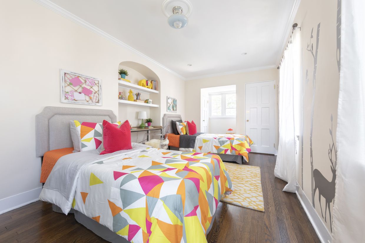
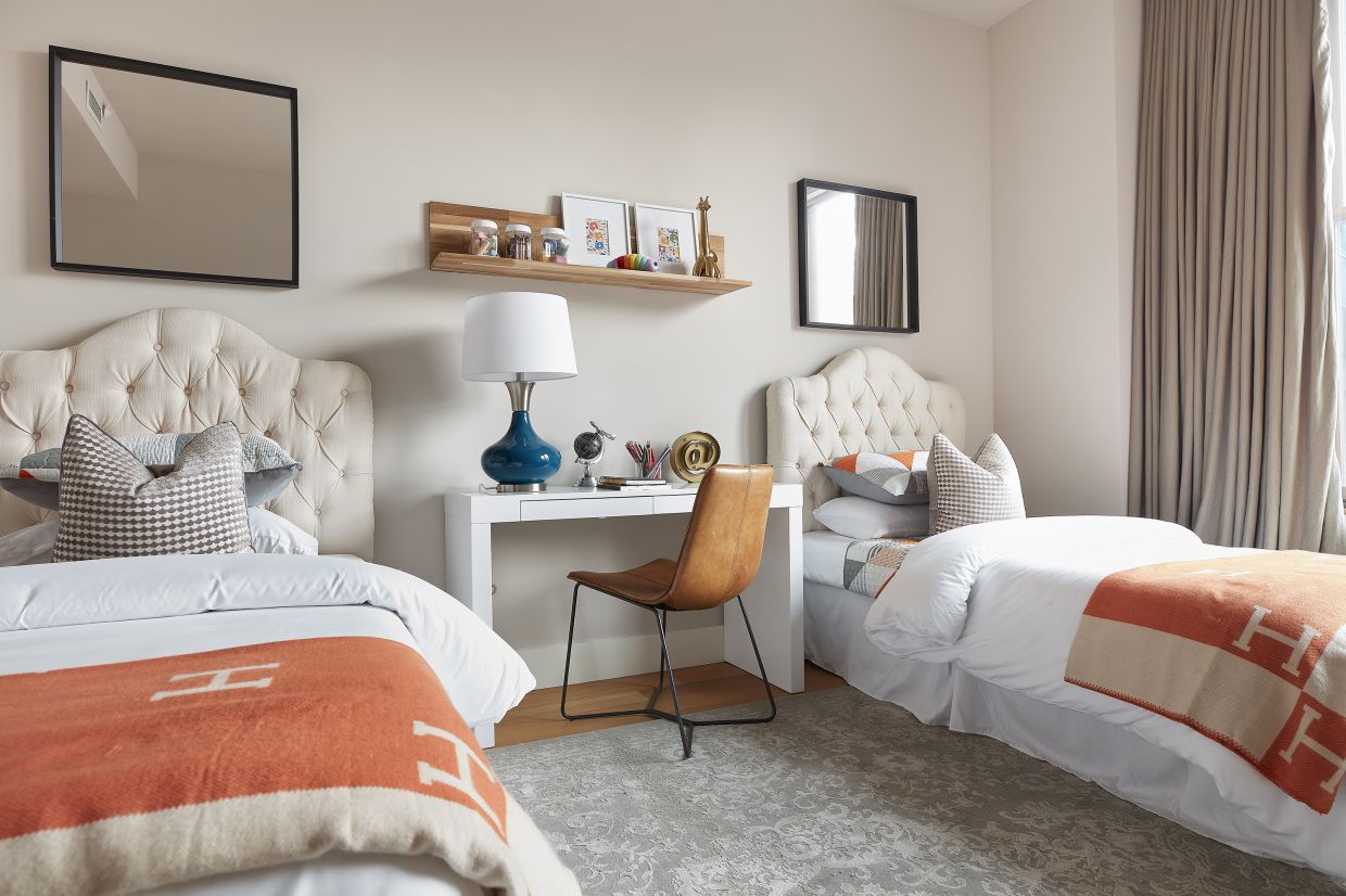
Bedding in bright, vibrant colors helps create a bright and friendly vibe in this kid’s bedroom. Photos: Handout/TNS
Accessories and accents can be used to bring bright, bold colour into a space.
Photo: Handout/TNS
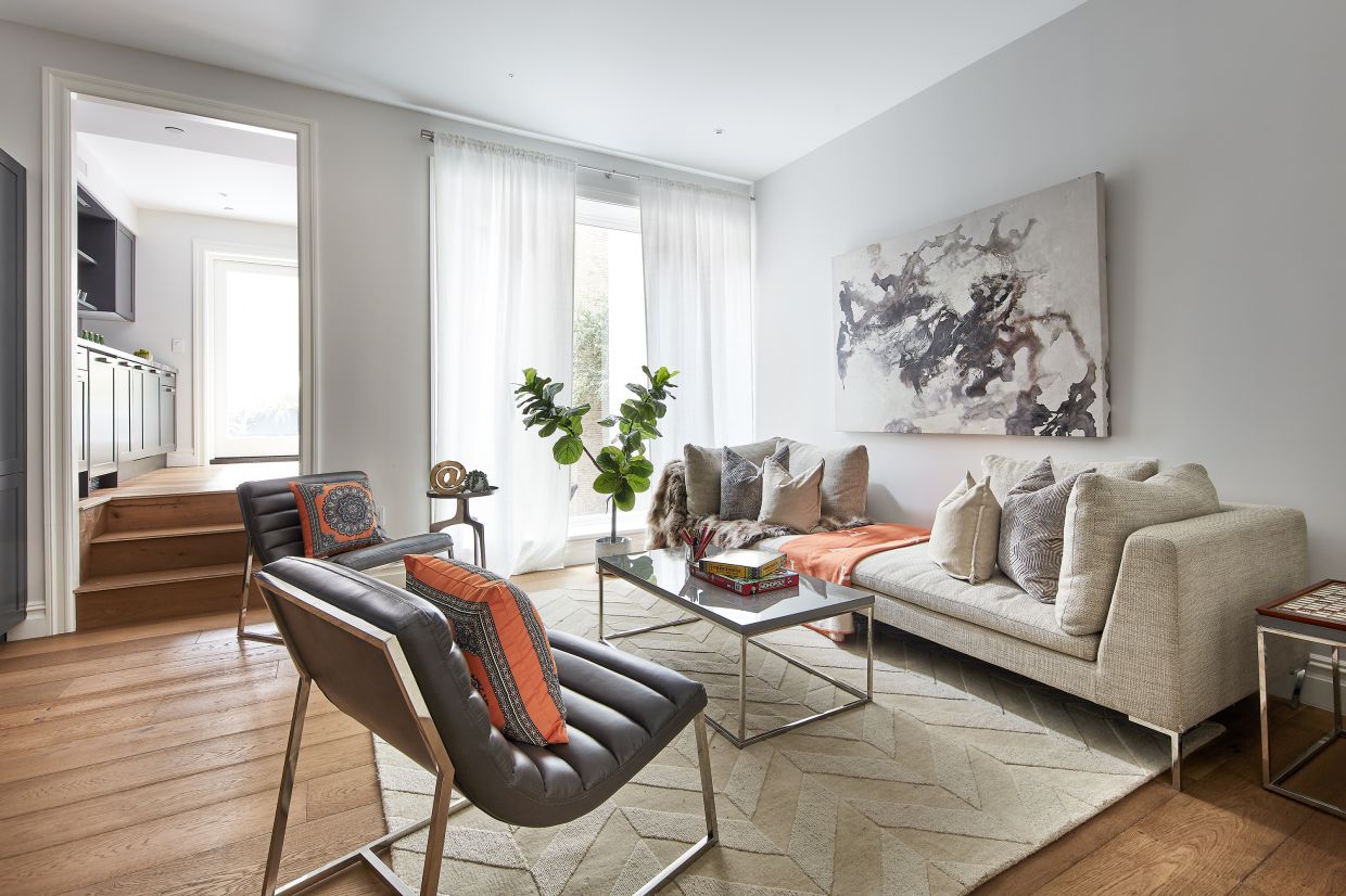
Bright orange throws are paired with an electric blue table lamp for a burst of unexpected colour.
Photo: Scott Gabriel Morris/TNS
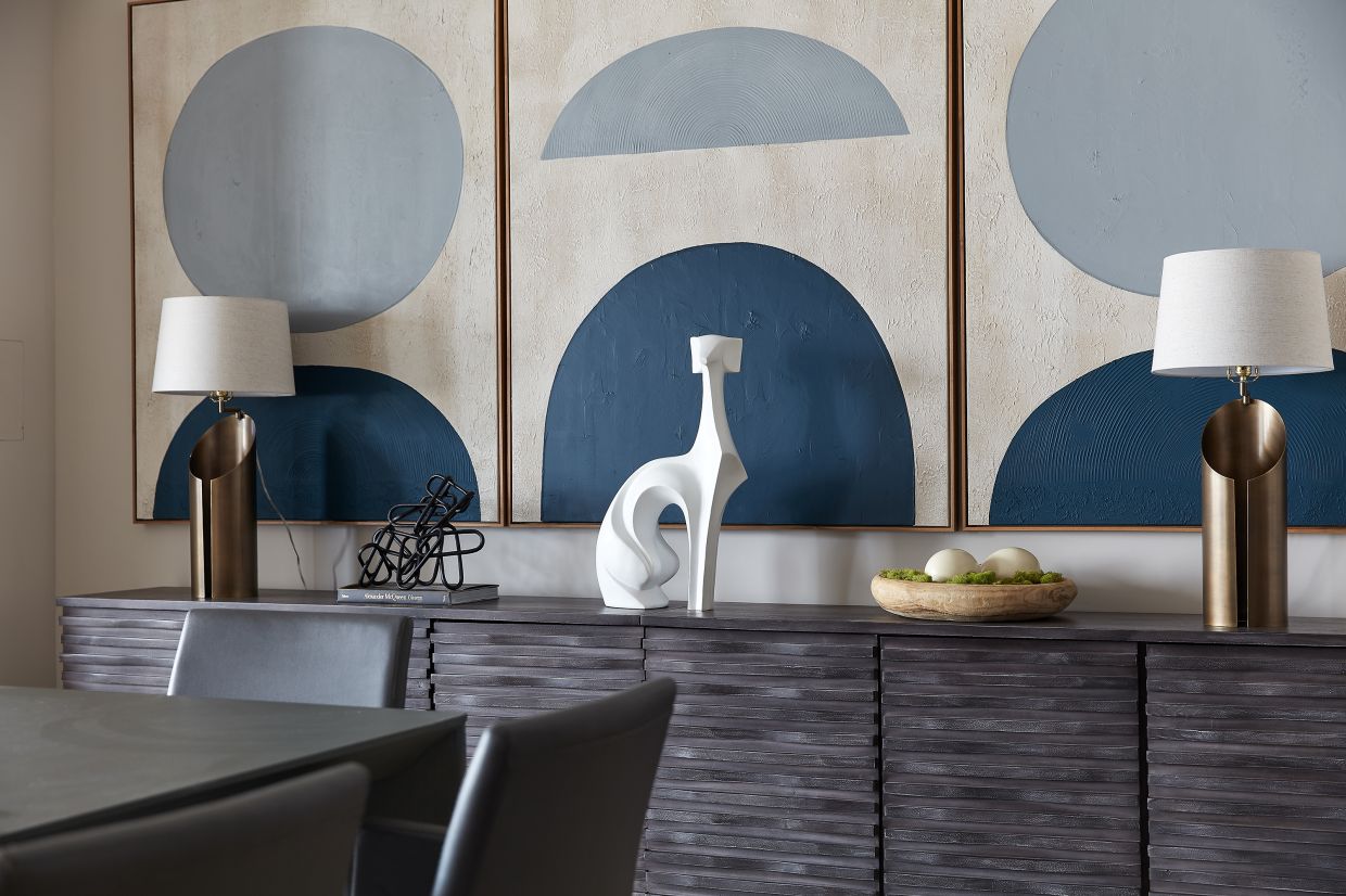
Shades of blue create an interesting color triptych in a dining room space.
Photo: Scott Gabriel Morris/TNS
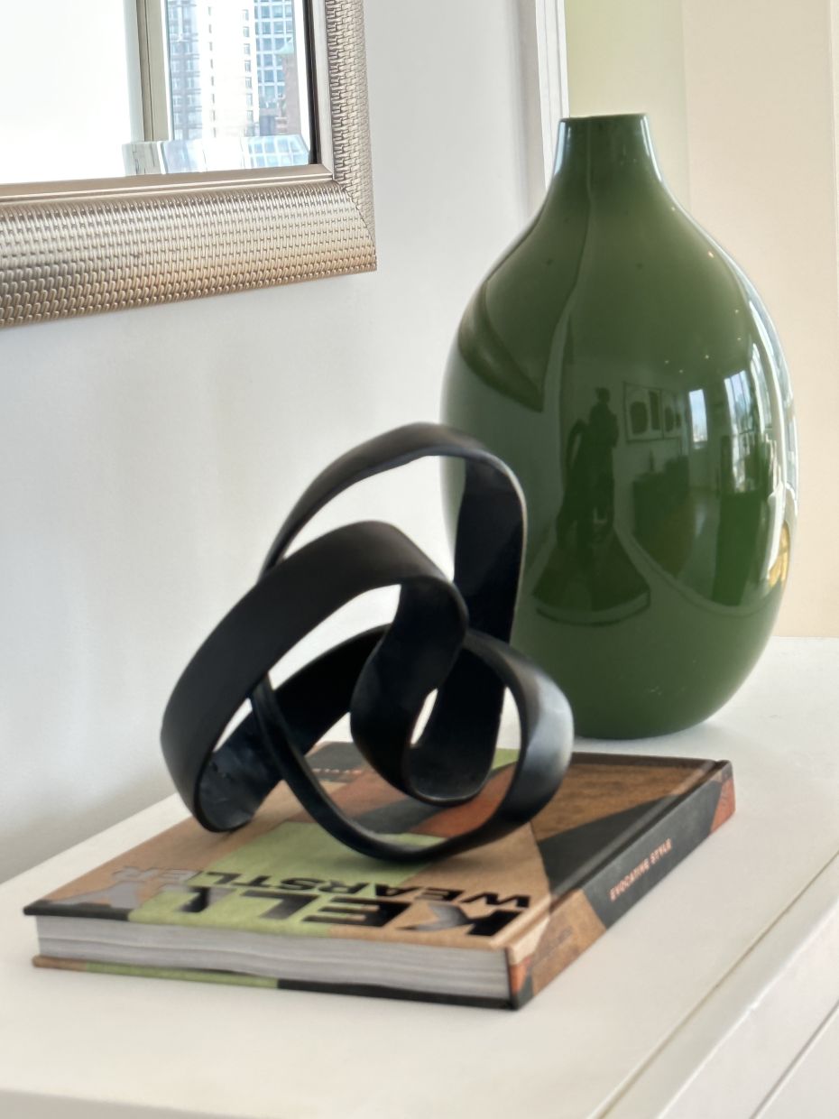
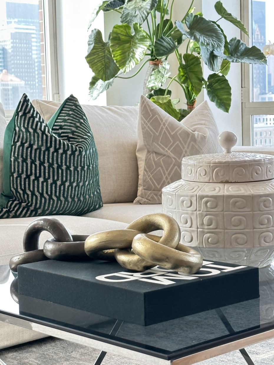
Greenery and other green accents help add a bright, vibrant pop of color.
Photo: Handout/TNS
Pops of orange help add a lift to neutral family room space. Photos: Scott Gabriel Morris/TNS