

As a child, Lee Sang-hyun had no interest in sitting down and holding a pen. At the age of 11, his mother, hoping to nurture focus and discipline in him, enrolled him in an after-school programme that teaches “seoye,” or traditional calligraphy.
Instead of grabbing a pen, he spent his days grinding an inkstick on a slab to make ink. When the teacher wasn’t looking, he would scribble on the white walls with a brush stained with black ink.
One day, he was caught in the act. Expecting a scolding, he braced himself for punishment. But to his surprise, the teacher simply smiled and said, “I’ve always found this white wall too dull. Why don’t you turn it completely black?”
He took on the challenge. He started painting the wall black every day.
Soon, he discovered it was difficult to maintain an even shade. His teacher then explained, “Ink concentration isn’t always consistent, which is why achieving a perfectly uniform black wall is so challenging.”
Four decades later, Lee is widely regarded as a trail-blazing Hangul calligrapher.
At the Korea Herald’s headquarters in Seoul, he reflected on the experience as one of the defining moments in his life.
“(The teacher) was the first person who ever praised me and taught me to think before acting,” Lee said.
Bringing inkwork to the masses
Even to those unfamiliar with the art of calligraphy, Lee’s penmanship is recognised through a variety of high-profile projects.
In 2015, Google unveiled a special Hangul-themed logo, penned by him, in celebration of Hangul Day.
Before him, such projects were uncharted territory for calligraphers.
How did Lee make a name for himself in the field of commercial branding?
“While studying seoye, I thought it was an art reserved for only a few great masters,” he said.
“One day, I saw a great authority in the field walking in Insa-dong. My heart pounded at the sight of him, but to other passersby, he was just another old man.”
It struck him then that seoye artists were not given the recognition they deserved in Korea.
As much as he loved seoye, it pained him to think that the art had lost contact with the majority of the public and was perceived as a thing of the past.
Determined to modernise, elevate, and popularise Hangul calligraphy, Lee set out on a mission to change that at the age of 26.
This was the late 1990s and most movies, dramas, signs and production packaging used standard computer fonts, Lee explained.
“I wanted to replace those digital characters with handwriting art.”
Lee visited thousands of companies, advertising agencies, publishing houses and film studios, pitching the idea of calligraphic branding. But as an unknown 20-something, he was often turned away before even getting the chance to explain.
Most designers at the time did not even know the English word “calligraphy,” and explaining it with the Korean term “seoye” instantly conjured up the image of something antique and outdated. So he coined the catchphrase: “Calligraphy is handwriting infused with emotion.”
After facing rejection after rejection, his first breakthrough came in 2000 when he visited the design office of food giant Nongshim.
At first, no one paid him any attention – until one executive overheard his pitches and invited him into his office.
Lee was given a chance to design the logo for a new product, Chun Myeon, which means “spring noodles.”
“Since my focus at that time was more on Chinese calligraphy, I wrote in a free-flowing, artistic style,” he said.
“But when the executive saw it, he asked, ‘Who’s going to read this? Calligraphers might appreciate its artistic value, but everyday consumers need readability.’”
Though stung by the criticism, he adjusted his approach to balance artistry and style with legibility. His revised design was submitted along with several others. To his and all the other designers’ surprise, Lee’s work was chosen.
From million-selling books to films
Although his work for Nongshim marked his entry into the commercial space, true success came from the publishing industry. In his late 20s, he visited over a thousand publishers, tirelessly seeking opportunities.
His big break came in 2003 when he was commissioned to design the title for the 10-volume novel Wind, Clouds and Tombstone by Lee Byung-joo.
The Korean word for tombstone, pronounced as “bi,” is a homograph of the Korean word for rain.
Initially, he misinterpreted the meaning of this word, assuming it meant rain. He designed the title to reflect a poetic image of wind, clouds and rain. When the publisher asked if he had read the book, Lee lied and said yes.
However, the publisher sensed something was off and told him to read it again.
Only then did Lee realise that that word referred not to rain but to a solitary tomb weathered by time and war.
He redesigned the character with a sense of erosion and wear, creating Korea’s first-ever calligraphic book title. The novel became a bestseller and other publishers began flooding him with inquiries.
Lee also targeted the film industry, believing that calligraphic movie titles could make Korean films more distinctive, especially for international markets.
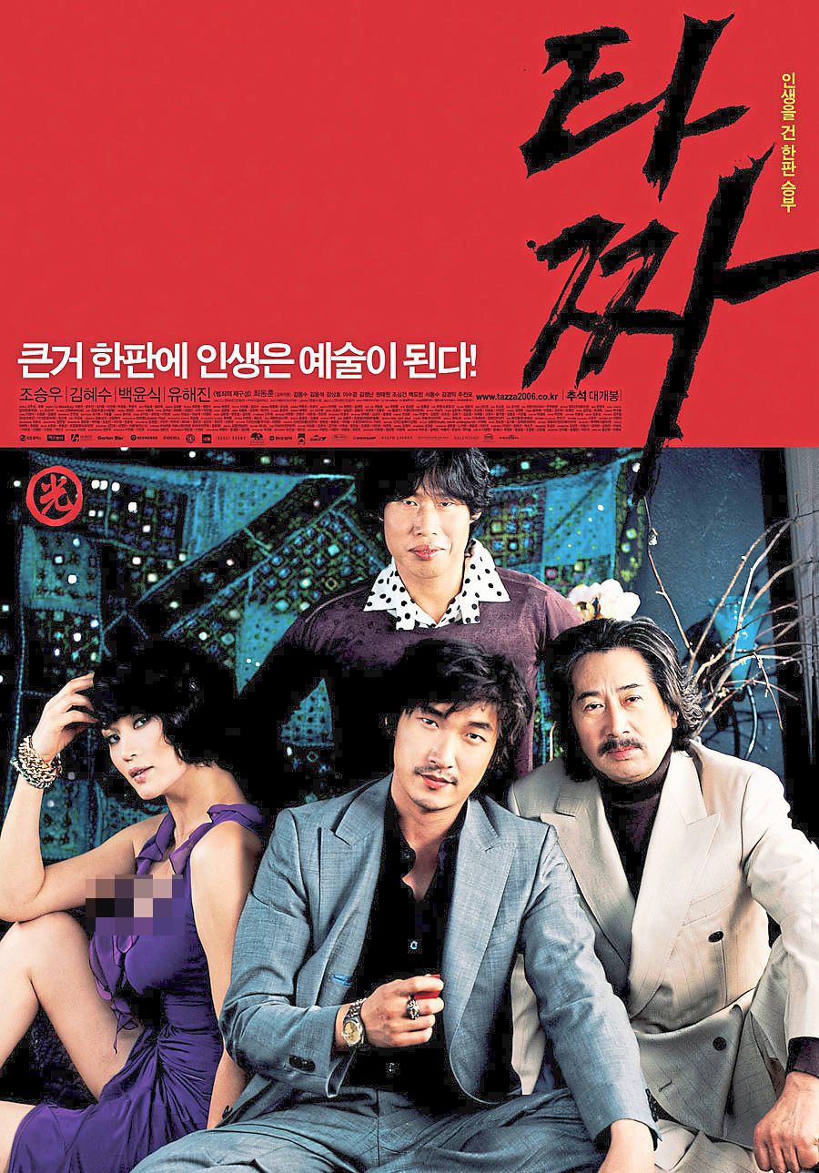
His early projects included Arahan and Blood Rain, but his major breakthrough came with hit gambling movie Tazza: The High Rollers, starring Cho Seung-woo and Kim Hye-soo.
To truly capture the essence of the gambling world, he went undercover at a gambling house, where people played hwatu, a Korean card game. Observing the players, he paid close attention to their mannerisms.
Back in his studio, he played the game with his colleagues.
When he thought he had a winning card, his associate attempted to take the whole pot of 100 won coins, thinking he had won.
At that moment, Lee grabbed the associate’s hand and slammed his card down with full confidence.
Feeling the rush of the moment, he immediately picked up a brush and painted the movie title, which became the poster for the film, which garnered a viewership of 5.6 million people.

Expanding legacy
Over the past two decades, Lee has worked on more than 10,000 projects across industries, collaborating with major brands in the music, food, beverage, film, publishing, automotive and electronics sectors.
He has even performed live calligraphy demonstrations in New York’s Times Square and Australia.
Despite his success, his transition from seoye to calligraphy was met with resistance.
Traditional seoye masters, who once praised him, labelled him an outcast for commercialising the art form. But Lee remains steadfast in his belief that popularisation is essential.
“For seoye to thrive, it must be recognised by the public,” he said.
“If it remains an exclusive domain, no young people will continue the tradition.” — The Korea Herald/ANN